Power BI vs Tableau vs Google Data Studio
Use case based comparison of the most popular no-code tools
At IndiaDataHub we work with broad variety of datasets and generate several visualization artifacts such as reports and dashboards on a regular basis. We are therefore always on the lookout for the best fit tool for specific visualization needs.
Based on our experience we have curated pain areas that even the best visualization tools struggle to support.
In this blog, we will compare three of the most popular no-code tools – Power BI, Tableau and Google Data Studio on how well they fair in addressing our pain points.
These days, there is lot of focus on advanced level features such as generating automated AI insights with each vendor trying to add more and more advanced features. In this blog we will take a step back and evaluate these tools on how well they can meet some of the basic but common scenarios in visualization.
As we always do, let us look at a real-life use case. In our previous post we created an automated newsletter on housing price Index in India. Let us see what is wrong with the visualizations in that newsletter and how we can improve them.
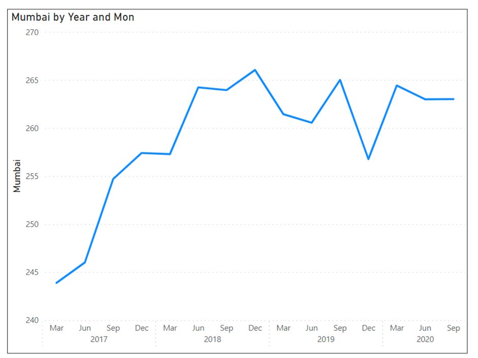
Let us look at the housing price trends chart closely. What is wrong with this page?
The x-axis labels are yearly. They gives no indication of the data frequency or what was the most recent data point. Someone looking at the chart may not understand whether it is updated every month or every quarter or once a year.
What happens when we add month to x-axis labels? The labels will no longer fit in the space allocated to the visual. Rotating the x-axis labels is a possible solution.
One may be interested in a comparison metric such as what was the year-over-year growth for house price index.
In additional to these we are currently sourcing data manually by uploading the spread sheet. Sourcing data through an automated source such as web API will make our life much simpler in keeping the dashboard up-to-date.
Now, let us look at how each of the three tools (Power BI, Tableau, Google Data Studio) fare on on the above scenarios.
Note that we have intentionally avoided any complex transformations while comparing the tools keeping ease of use in mind.
In summary, although Power BI has less crosses in the table above, we cannot say Power BI is a superior tool. The most suitable tool for you depends purely on your type of business and reader profile.
If you are a journalist and creating media content in which the data is straightforward and key is to create interesting visualizations, tableau may be the best solution for you. If you are a financial analyst and work a lot with diverse datasets that require complex calculations on spreadsheets, Power BI may be the best bet for you. If you are marketer and are interested in analyzing traffic on your site, Google Data Studio may be the best fit solution.
However these are generic scenarios. Choice of tool depends on several other factors such as frequency of changes required in content, volume of data, frequency at which data changes and the skill set of the team etc.
Therefore we at IndiaDataHub, use multiple visualization tools depending on the use case.
In the appendix section below, we have shown few examples of the pain areas of the three tools.
Appendix - Pain Areas for each tool
Power BI:
Creating custom visualizations is the biggest challenge with Power BI
Some of the commonly used Date formats are not available. For example MMM,YYYY format is not part of available Date format types. We cannot show x-axis label as Sep,2021 we have to use mmmm, yyyy which will always show complete month.
There is a workaround using data transformations as shown below. However, all of this is complex and requires trained data modelers.
In Power BI orientation of x-axis labels is taken by default depending on the size of the visual. You cannot change the label orientation. Also the number of labels in a-axis is taken by default. You cannot specify tick intervals.
Tableau:
Tableau looses its intuitiveness when it comes to Data Transformation.
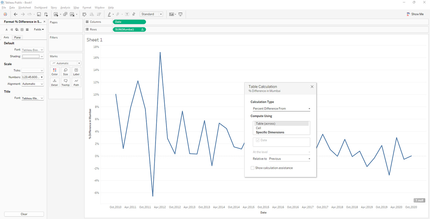
Performing data transformations is not as intuitive as creating visualizations in Tableau. It is easy for unfamiliar users to make mistakes with data handling. Let us look at the scenario of plotting year-over-year growth for our house price index data set. If we have a quarterly data set like ours, year-over-year growth is not available in Quick Table Calculation as shown.
We can use the add table calculation method. Right-click a measure in the view and select Add Table Calculation. However, there are limited options for difference from as shown below. Tableau by default allows only previous, next, first and last.
As our data set is quarterly, we need difference from current period minus four datapoints , i.e., previous year. We have edit the formula manually to -4 as shown.
Google Data Studio:
Google Data Studio is not the most user friendly tool for working with traditional datasets such as excel spreadsheets.
The default chart loaded based on your selection may not be the best for your data. For example, with our housing price data, the time-series chart was loaded. Several formatting options do not work with time-series charts. We have to double check on whether we are using the correct chart type.
The auto alignment of x axis labels is a problem. Google data studio allows limited formatting options for axis. Maximum customization is possible but can only be done programmatically.
Data Transformations require data blending and knowledge of advanced merging techniques if you are not using standard data sources such as Big Query. For example in our use case, we had to perform a complex three step transformation to plot the year-over-year growth.
Add Previous year as calculated field.
Blend with same data use previous year as key to join in left table and Date as key in right table this will give previous year value.
Create a calculated field for % YoY change. Plot the graph.


